
If you’re unhappy with your website conversion rate, you’re not alone. There are many reasons that could be holding people back from taking the next step with your financial institution, whether it be submitting a form or clicking on your CTA. The good news is that there are many fixes your FI is more than capable of making.
Below we’ll expand on common reasons that lead to low conversion rates and steps you can take to improve your website.
1. Unclear Calls to Action
You should have clear goals in mind for the people visiting your website. You may be directing consumers to open an account, enroll in online banking, or read a recent blog post. People won’t be clicking on your calls to action if they are vague or hidden by a busy webpage. You can perform A/B testing on your website to see if changing the CTA button’s location, color, text, or size makes a difference in its click-through rate.
2. Slow Page Speed
People can be impatient, and slow page speed can be detrimental to your website’s conversions. A slow-loading website can cause lower SEO rankings and a loss of interest from your consumers. Common root issues to look into include unoptimized images, messy coding, or a high number of HTTP requests. The good news is that slow page speed is fixable, and there are many available tools to check load time so you know where you stand.
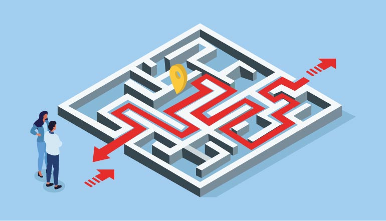
3. Difficult Navigation
You want your website to be intuitive and easy to navigate for consumers. If your main navigation is too overcrowded, limited, or not responsive, this could be frustrating for new visitors. To fix navigation issues, it’s imperative to plan a clearly defined site map that divides your service categories. If you don’t have one already, you can add a search feature to your website that will lead visitors to the page they’re trying to find.
4. Low-Quality Images
In addition to getting rid of unoptimized images that slow down your page speed, your images should all be high-quality and properly compressed for your site. It’s worth investing in professional images, and many institutions include images of their branches, staff, or community involvement so that visitors can grasp an understanding of your culture and the people they may interact with at your institution.
5. Jargon Overuse
If website visitors can’t understand your offerings, then it’s unlikely that they’ll click to find out more. You want to showcase all of your beneficial financial products and services to potential consumers, but using too much jargon on your main pages can be confusing and off-putting for people seeing your site for the first time. It’s important to use language that is straightforward so that people can easily understand and engage with it.
6. Not Optimized for Mobile Users
According to research conducted by Statista, mobile devices generated over 50% of global website traffic in 2021. To appeal to everyone who visits your site, it should be optimized for all devices, including for mobile users who are on the go and discovering your FI for the first time. You may go through testing to ensure your site is optimized so that when someone visits your site on their mobile device, there are larger navigation buttons, properly formatted content, and optimized images.

7. Visually Unappealing
If you feel that your website is lackluster or doesn’t have a professional touch, then finding the right website designer is well worth the investment. This can save you loads of time and energy, and utilizing an outside source can produce a better quality website than what you could make on your own. This way, your staff can focus more time on internal campaigns and consumer communication, and you gain an aesthetically pleasing website that’s designed with exceptional user experience in mind.
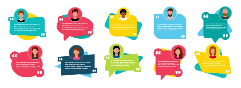
8. No Client Testimonials or Trust Symbols
People’s relationships with their financial institutions are built on trust, so it’s beneficial to provide examples of the trusted relationships you’ve built so far. If you don’t include any client testimonials on your website, now might be the time to reach out to clients to ask if they’d be willing to speak about your products and services. People enjoy reading reviews, whether they are buying a new pair of shoes or enrolling in a new checking account, so it’s in your institution’s best interest to show the hard work you’ve put into building your relationships. It’s also important to include well-known trust symbols, including specifying whether your FI is an Equal Housing Lender or insured by the FDIC or NCUA.
9. Hard to Find Contact Information
You should have contact information easily visible. This way it’s easy to connect with your FI through phone, email, or social media. Ideally, your website should include contact information at the bottom of each page so consumers don’t have to search to find it. Many people want to connect with someone to talk through concepts or ask questions, so it’s important to have this information readily available.
10. Thin Content
If you direct consumers to a page with thin content, they may have additional questions that need answering. A great way to keep consumers’ attention and build trust is to provide content that is thought-provoking, educational, and interesting. A blog is a great addition to any bank website, and your team should be on top of providing new content that keeps people engaged.
Learn what Prisma’s marketing automation software can do for your financial institution, and visit Prisma’s blog posts for more useful marketing tips and strategies.
Image credit: Adobe Stock